
Query analysis
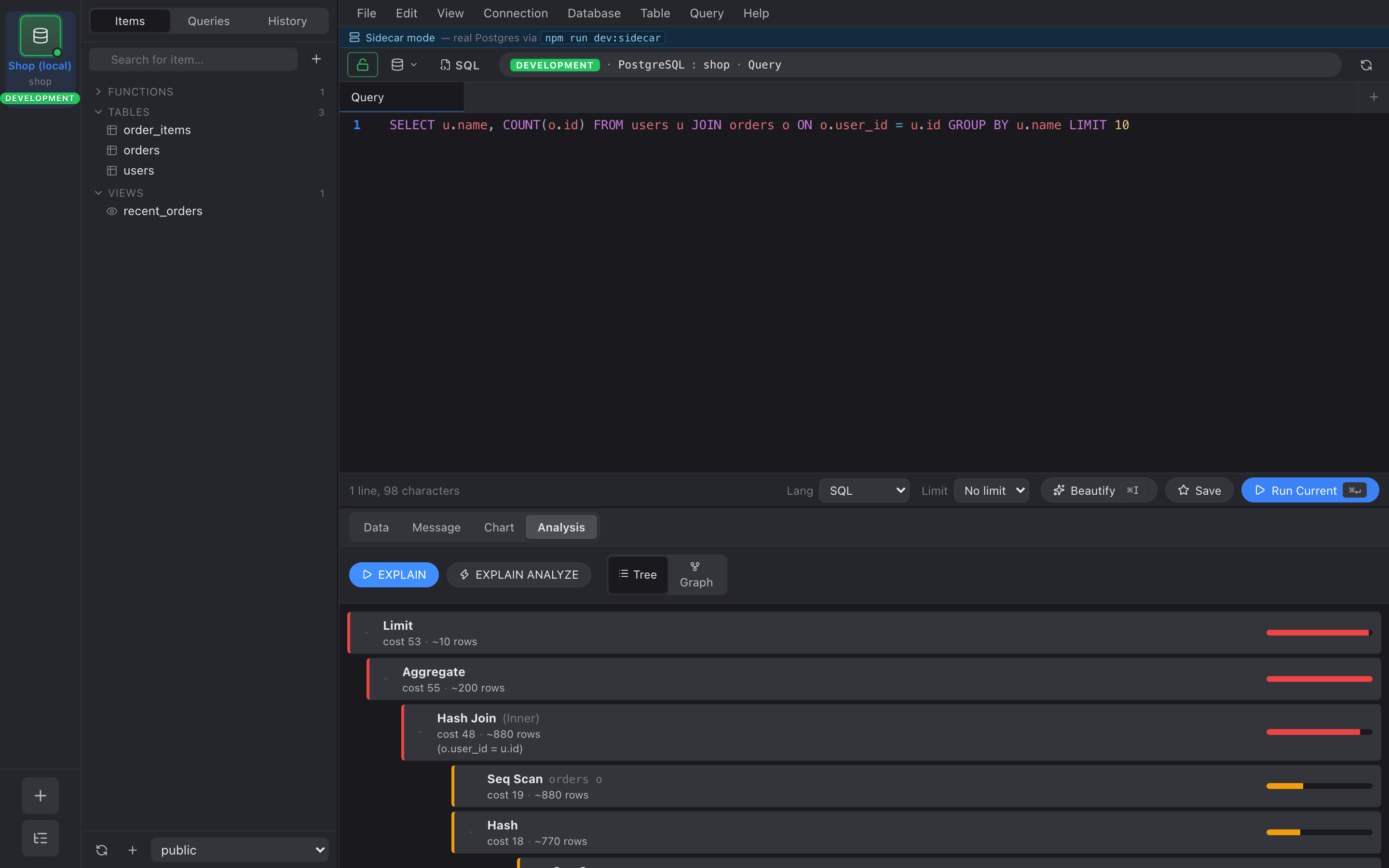
The Analysis tab in any query view runs EXPLAIN (or EXPLAIN ANALYZE) for the current SQL and renders the plan as a hierarchy.
EXPLAIN vs EXPLAIN ANALYZE
Section titled “EXPLAIN vs EXPLAIN ANALYZE”- EXPLAIN — the planner’s cost estimate. No execution, safe on production.
- EXPLAIN ANALYZE — actually runs the query and measures every
node. We wrap it in
(ANALYZE, VERBOSE, BUFFERS, SETTINGS, FORMAT JSON)so you also get buffer / IO counters and the relevant planner GUC values.
Reading the tree
Section titled “Reading the tree”Each node shows:
- Node type — Seq Scan / Index Scan / Hash Join / Sort / …
- Target — table, alias, or index name when applicable.
- Cost or actual time — when ANALYZE is on, you get the real
number; otherwise the planner’s
Total Cost. - Rows — actual row count × loops when ANALYZE is on, planner estimate otherwise.
- Condition —
Index CondorHash Condif present. - Filter + rows-removed-by-filter counter.
The left border of each node is color-coded by its proportional weight: green ≤25%, orange ≤66%, red ≥66%. Click anywhere on the row to expand or collapse its children.
What to look for
Section titled “What to look for”Patterns the heat bar tends to expose:
- A Seq Scan that’s hot but the table has an index on the filter column → add it to the WHERE plan.
- A Nested Loop whose inner Index Scan loops millions of times → rewrite as a Hash Join or push a JOIN condition.
- Big rows-removed-by-filter counts on the outer plan node → pre-filter earlier in the pipeline.